I like it, but I have a question: what do you think of using the same style or filters for the pictures based on faction? Night seems obvious, dark and shadowy, maybe Wild could have exaggerated colours, that kind of thing?
Toby Sennett funny enough our initial pick lists were a bit like that… ( we had hundreds of pics in a colder for inspiration). But from a look rather than photography perspective. The wild were all heavily tatted and counter culture, Power was suited and muted, etc. Dark was latex and chrome and fetish and velvet and dark dramatics, and Mortality very human everday people. There’s still some srains of that in the ones we vhose, but dilutedly.
I kind of like the idea of Power done in Black and White.
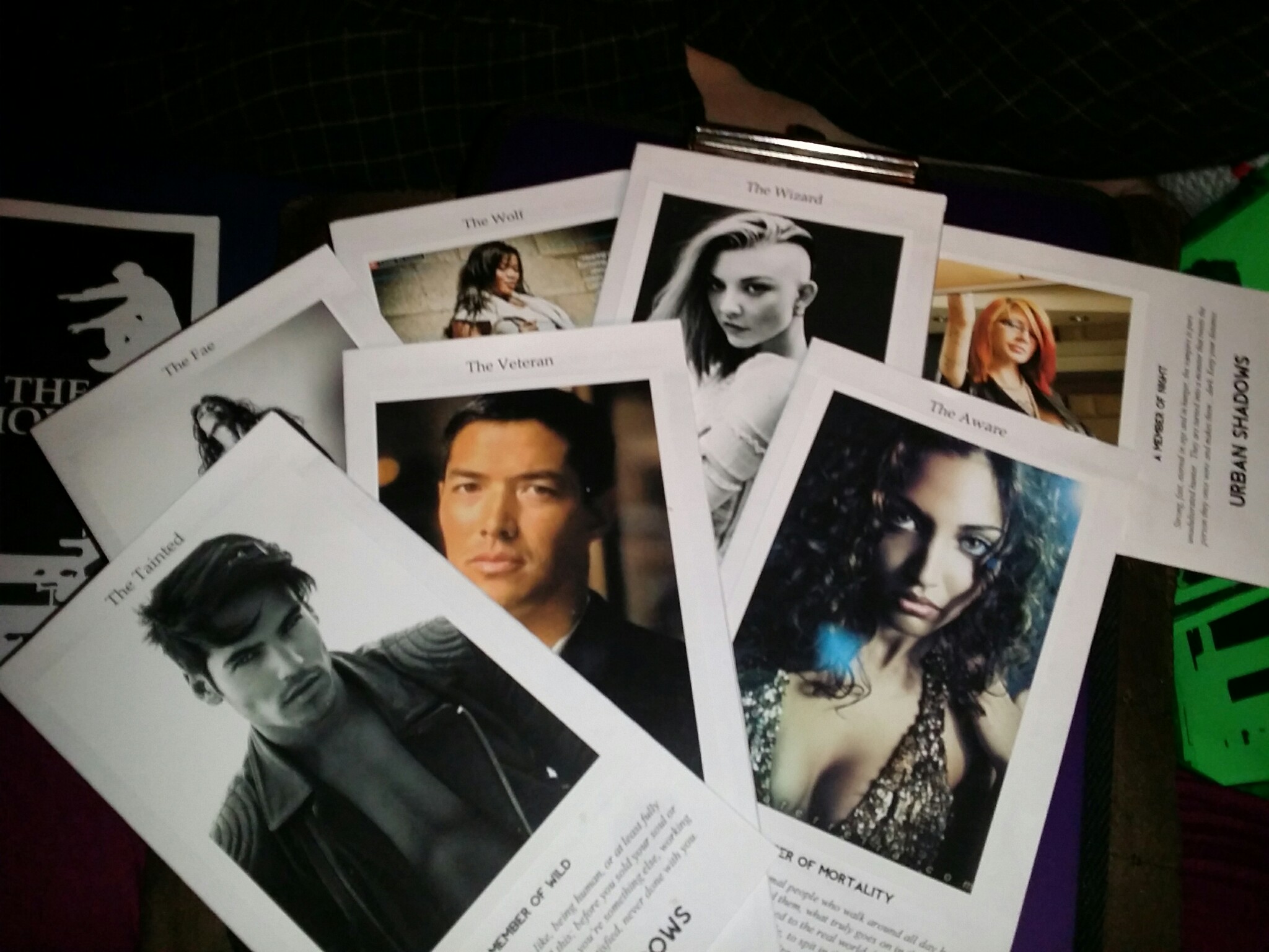
Oh so pretty!
I like it, but I have a question: what do you think of using the same style or filters for the pictures based on faction? Night seems obvious, dark and shadowy, maybe Wild could have exaggerated colours, that kind of thing?
Toby Sennett funny enough our initial pick lists were a bit like that… ( we had hundreds of pics in a colder for inspiration). But from a look rather than photography perspective. The wild were all heavily tatted and counter culture, Power was suited and muted, etc. Dark was latex and chrome and fetish and velvet and dark dramatics, and Mortality very human everday people. There’s still some srains of that in the ones we vhose, but dilutedly.
I kind of like the idea of Power done in Black and White.