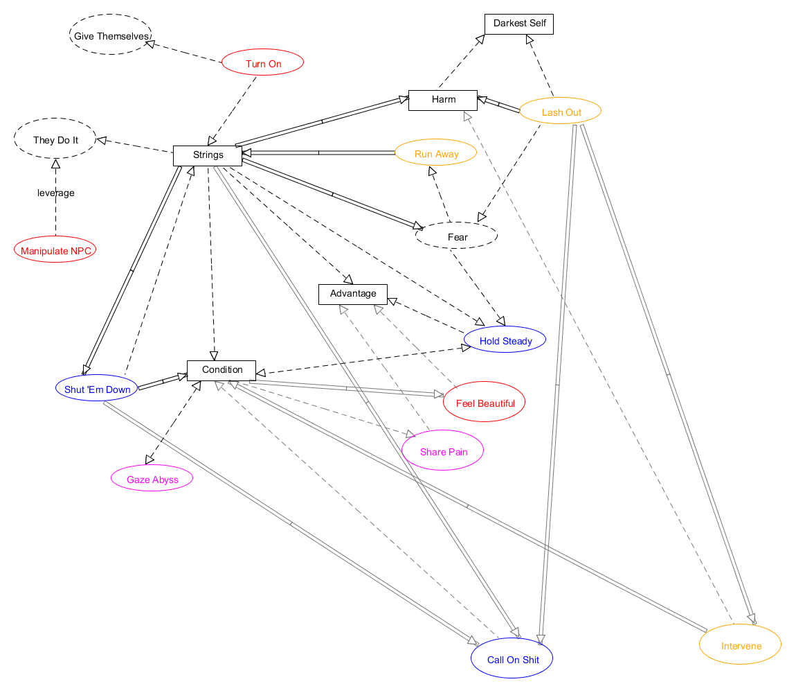
This is going to bear some explanation. I was curious about the internal economies of the game, so I made a diagram that shows the relationships between
Ovals are moves, rectangles are tracked quantities, and dotted ovals are fictional situations.
An arrow means ‘leads to’, either because a move creates that quantity or fictional situation. Strings lead to advantages, for example.
More subtly, arrows can also mean ‘consumed or becomes’, as is the case when Conditions are removed by Share the Pain.
Double lines indicate a subject switch. So the single line between Fear and Hold Steady means your fear becomes a need to hold steady. The double-line between a String and Fear means your String turns into someone else’s fear (the need to hold steady).
What the hell?
I’m doing this just to understand the interplay between moves, quantities and fiction. I’m noodling on a hack of my own, and I wish I had a diagram like this for it, so I thought a diagram for a game that works well might help me along.
Caveats:
Forgive the arranging, I know it’s hideous right now.
This diagram obviously leaves out the enormously important role of “da fiction” which surrounds everything.
There are probably several errors.
