Hi Sean Gomes
Any news on Carta Galaxia, UW 2.0 or where this community is moving after G+ implosion?
Hi Sean Gomes
Hi Sean Gomes
Any news on Carta Galaxia, UW 2.0 or where this community is moving after G+ implosion?
Carta Galaxia Development Update #27
Carta Galaxia Development Update #27
Finally finished the Campaigns chapter. Thanks to everyone who proivded feedback and suggestions over the past month, it was super helpful.
I’ve posted the current version in this post. Take a look, tell me what you think.
Next Chapter
The next chapter that I’ve been meaning to tackle is “running the game”, which was going to cover Exploration, Challenge, and Combat situations.
My early rough sketches of the Combat section of the chapter seem to be mostly A) Justifications for why the combat system is the way it is (i.e. “one roll to defeat an enemy”) and B) Examples of situations where getting to that “one roll” is the real challenge.
I have no idea if that will play out well or not. I’m taking inspiration from previous posts here in the community, but I’m open to suggestions.
https://www.dropbox.com/s/r4q0tex0linqshr/Chapter%201%20-%20Campaign%20Setting.docx?dl=0
Carta Galaxia Development Update #26
Carta Galaxia Development Update #26
What’s this? A mere two days after the last update? I couldn’t possibly keep up this pace, but I got quite a bit of writing time this past weekend, so I figured I’d share.
In my last update I posted the new 2-pager of The Sword. Seemed to go over fairly well, so I tackled the next example: the Core. Those of you who have been following development may remember the ill-fated Core campaign setting that I ended up torpedoing a few months ago. The setting was bloated and over-designed, and doing something so detailed went against a number of designs and principles of the game.
I recovered and modified the central elements of the old Core material, and adapted them to the new two-page structure.
Unlike the previous Campaign example, where you had Factions and Points of Interest, the Core is a dystopian future where the Factions are the points of interest. Or rather; all interesting things are intrinsically tied to the faction.
So I changed up the layout a bit here; each faction gets a couple of points of interest, things to see and interact with, which will hopefully spark story ideas.
https://www.dropbox.com/s/xnbj6b7ihxfop95/Example%20-%20TheCore_v1.docx?dl=0
Carta Galaxia Development Update #25
Carta Galaxia Development Update #25
Really appreciated the feedback from the last update. I took all of it into account, and came to the conclusion that while I would really want to do one-page Campaign Settings, it would serve the audience better to go up to 2 pages (especially since I’m sticking to the 6×9 page format, so less text per page)
Here’s the new version of The Sword, one of several example Campaign Settings that will be available in the chapter.
https://www.dropbox.com/s/wnjlptm765jyjiv/Example%20-%20TheSword_v2.docx?dl=0
Carta Galaxia Development Update #24
Carta Galaxia Development Update #24
Whoooee, this has been a heck of a month. Sorry for the lack of updates!
– Got to run a small booth at Montreal ComicCon. It was super fun meeting folks, and some even joined the community, so warm welcome to all of you! Bienvenue parmi nous!
– I’ve been doing crazy overtime with my day job. We’ve got a pretty huge update coming, and I’ve been up to my neck in deadlines and hard-locks and devtests and so forth. Haven’t had much time or mental capacity for writing, sadly.
– On that note, I’ll be away until September; I’m going to be working the demo floor at Gamescom in Germany. I’ll try to check in but my access to internet will be horrifically limited.
I’d like to get feedback on something I’ve been tooling with:
As with every chapter, I’m including a handful of examples. What I’ve linked here is one of the examples from the Scenario chapter, meant to be the start point of a campaign. The intent is to give the players a rough idea of what the universe is like, the look and feel and tone, etc. I’ve tried to condense that down to a single 6″ x 9″ page. But it’s a fine line to tread between “too dense” and “not enough to work with”
This is part of my growth as a designer, so I’m still toying with ideas, layouts, etc, and I’d appreciate comments. Does this work? Is it usable? Or is it missing something major?
https://www.dropbox.com/s/zjoiaypdi7j4a1k/Example%20-%20TheSword.docx?dl=0
Carta Galaxia Development Update #23
Carta Galaxia Development Update #23
Happy (slightly belated) Canada Day everyone! And Happy pre-emptive 4th of July to our southern friends.
It feels good to be back in the saddle, actually getting writing done. I’m trying to pace myself, keep a good work/writing/family balance going (I hear tell of a mythical thing called sleep, I’ll have to give it a try).
I’m happy to report that I have finished the first draft of Chapter 2 – Jump Points, and I’d be very interested to hear feedback. I’ve attached it to this post, so please check it out!
It’s separated into 3 parts:
– How to create a compelling Jump Point
– Running a Jump Point
– 6 Example Jump Points
For the examples, I tried to give a wide enough diversity in the examples, scenarios that will cater to different character archetypes and playgroups. Most of these are Jump Points that I’ve run for a variety of play groups, so they’re at least somewhat tested (Checkpoint ended up being super deadly the two times I ran it and needed to be toned waaaay down).
I’m quite pleased at how the overall formatting of the Jump Points came out. I tried to keep them brief (1 page) without making them too obtuse or inscrutable. Tell me if you think they need to be 2-pagers with more guidance instead (like the original “Planet-Bound Salvage” example Jump Point from the UW core book).
https://www.dropbox.com/s/bjaux4mqxn8m32s/Chapter%202%20-%20Jump%20Points.docx?dl=0
Carta Galaxia – Yet Again
Carta Galaxia – Yet Again
So after carefully considering all the feedback, I’ve decided that I will be starting back up on Carta Galaxia with a reduced scope. I think I over-extended myself and was unable to deliver on what I thought I needed.
The new plan for CG is this: A few pages going over the theory of a topic (Settings, Jump Points, NPCs, Worlds) then a few pages of examples to lift and drop into the game in a pinch. The back of the book will have a slew of pre-made assets to drool over (because while it does add clutter, I’m a little nostalgic for the “gear porn” pages of more traditional games).
Plus I’m toying with something special to me: a Lifepath system for Uncharted Worlds. Just because.
So here’s the new breakdown of Carta Galaxia. I hope to have new chapter previews available soon. That said, I’m going to take things slower to avoid burning myself out again.
Campaign Settings
– – Creating a New Setting
– – Premade Campaign Settings (including factions)
Jump Points
– – Creating a Jump Point
– – Running a Jump Point
– – Premade Jump Points
People and Places
– – Creating New Locations
– – Premade Locations
– – General NPC advice
– – Premade NPCs
Characters
– – Lifepath (alternate character creation)
Running a Game
– – General gameplay (Difficulty, Get Involved, etc)
– – Combat examples
– – Exploration
– – Long Term Campaigns
– – – – New Advancement system (from FBH)
Arsenal
– – Premade Assets
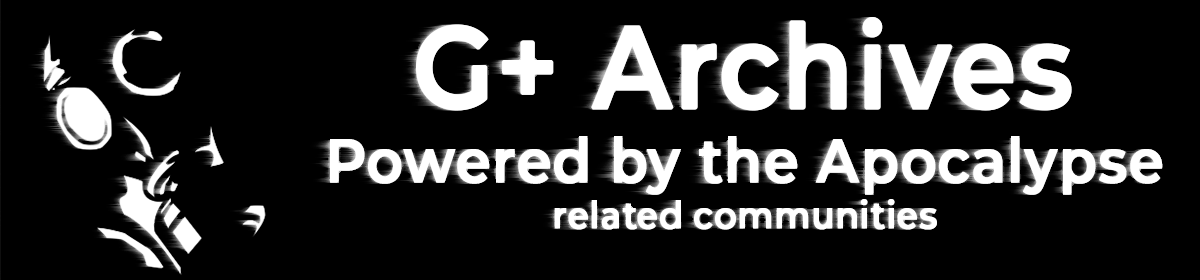
Carta Galaxia – Art Spotlight #5 – “Sheriff”
Carta Galaxia – Art Spotlight #5 – “Sheriff”
Yet another awesome Claudia Cangini piece, and another movie poster reference. This one is also a callback to the dinosaur-riding, poncho-wearing robot from the cover of Far Beyond Humanity. As usual, the Art Brief is below.
5 – Sheriff
A riff on the old spaghetti-western style of movie poster, specifically the Sergio Leone poster for “A Few More Dollars”. The piece will be separated into 4 “value layers”: foreground, midground, background, sky.
In the foreground (darkest), left of center, we have the main figure: A robot in a poncho. His torso is covered by the poncho, his legs, right arm, neck and head are visible. His limbs are thin and have obvious wiring, hydraulics, pistons, etc. His head is vaguely oval, and slightly blocky, with an antenna extending from the ear piece. He’s holding an advanced looking plasma pistol by his side, white smoke coming out of the barrel. His pose should be very similar to the “A Few More Dollars” poster, but taking up the left side of the image rather than centered.
The midground (dark grey) is the silhouette of rocks, spiky plants, and a half-buried car tire.
The background (grey) is the silhouette of a space colony. Square, blocky buildings with a massive satellite dish array.
The sky (light-grey/white) just has a large circle sun hanging over the town, and a few wispy clouds.
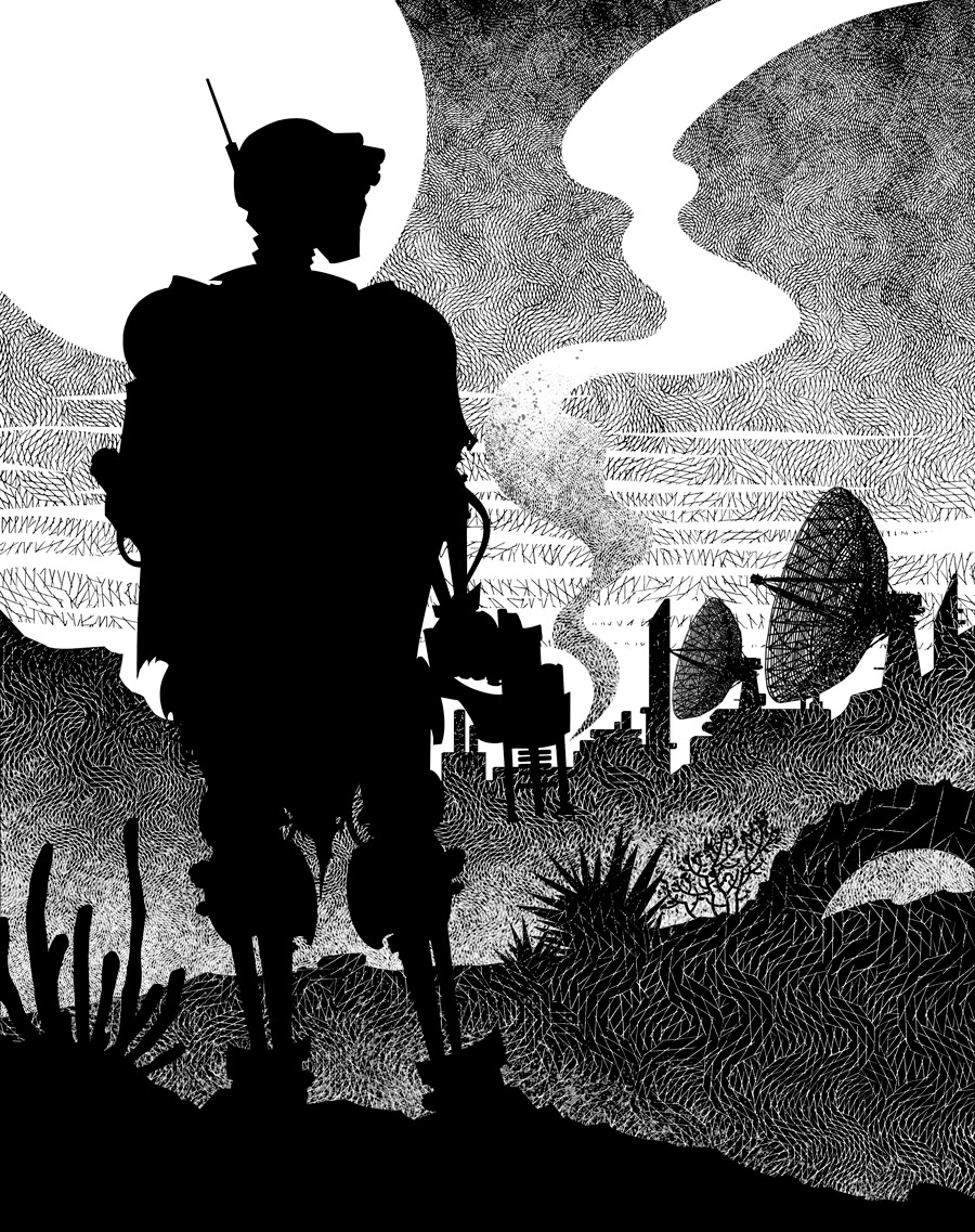
Carta Galaxia – Art Spotlight #4 – “Reach”
Carta Galaxia – Art Spotlight #4 – “Reach”
Another wonderful Claudia Cangini piece. This one went through a couple of revisions for scale, placement and such; ended up looking really awesome. I like how the shading elicits juuuuust enough of a double-take to catch what you missed the first time.
4 – Reach
View from inside a complicated machine/computer. In the center is a power core/battery held from above and below by cables. Cables, little lights, pipes, and circuits in the background. From the left, there is an opening, which is the only source of light. An arm is reaching into the machinery from that opening, reaching for the battery. They’re wearing a heavy-duty glove.
In the lower and upper right side, there are hints of an alien creature inside this tight space. A few obviously organic hints of the creatures, like long scythe claws or a spiky, segmented tail. It will mostly be in the dark, the focus will be on the power core and the hand coming from the left.
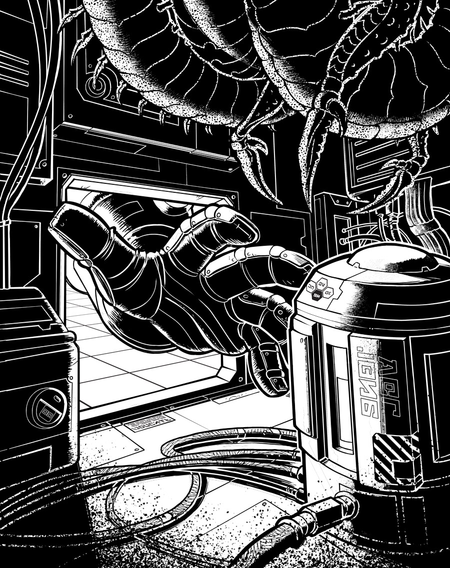
Carta Galaxia – Art Spotlight #3 – “Forbidden”
Carta Galaxia – Art Spotlight #3 – “Forbidden”
Bit of a hiatus, dealing with family stuff and general work overload. But we’re back with another awesome Claudia Cangini piece, along with the Art Brief.
3 – Forbidden
This is a remix/homage of the classic Forbidden Planet poster. Replace the robot with a woman in a bulky power armor suit whose helmet looks like the robot’s dome. She should look like the fainting woman in the cover. Replace the fainting woman with a thin (gender netural) robot. Background/clouds should remain roughly the same. No need for the poster text.