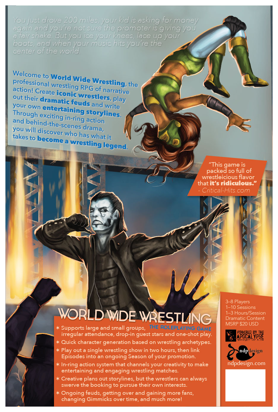
Back Cover, getting closer. Maybe too busy with the pullquote?
Thanks for the feedback, folks!
Back Cover, getting closer. Maybe too busy with the pullquote?

Back Cover, getting closer. Maybe too busy with the pullquote?
Thanks for the feedback, folks!
Comments are closed.
Is the text at the top getting lost in the gray on gray-ness of it?
When I print it out it’s pretty prominent, but on the screen it almost disappears. I’m not sure how it’s working, honestly. White text competes with everything else, black text looks like poop.
Maybe a lighter blue?
Yeah, I’d still go for more contrast for both text blocks at the top. Your goal here is less about art and more about grabbing attention on a store shelf.
Also, I’ma let Jason Morningstar yell at you about accessibility.
“Dramatic Content”
The pullquote is exactly the right level of busy.
I’m not completely in love with the oblique white flavor text aligned one direction, and the blue sell text skewed to the bottom edge of the same art element. It just doesn’t look right.
“THE ROLEPLAYING GAME” seems like it needs a little fine-tuning too.
Nathan Paoletta changing the color/value of that jumbotron screen would take me about 15 seconds, let me know if you need that to help out that text.
Blue on orange at similar values creates a strong visual conflict. Useful in some places, but possibly destructive here (where you have “THE ROLEPLAYING GAME” over orange).
The pull quote is good stuff, and it would be a shame not to have an endorsement like that on the cover.
The bolding in the blue paragraph is also worth looking at. You’re giving equal weight to the title of the product as to some useful key phrases. If you have a semi-bold or ‘medium’ weight to that font, you might want to employ that to push the key phrases back a little. As it is, that paragraph looks a little busy on screen, particularly since the bolded segments look clumped together over on one side. You could possibly even drop the bolding on everything but the title.
Hah, this is what you get for asking our opinions, Nathan- contradictory advice!
Don’t worry, I will filter it all through my keen artistic sensibilities and deliver a final product that satisfies nobody!
I haven’t had time to read all the comments, so apologies if some of these have been stated before. It’s a bit word-heavy for me — I think the blue pops fine, but the white at the top is so faint, it’s hard to read. Also, the design geek in me has a hard time with the same font being used for the angled text and the other text. It’s as if the blue text is sort of both in the background as well as floating above the background, and that seems a little off to me. I love the idea of the slanted text, and think it looks nice, but with the rest of the text there it seems off somehow. I guess one issue is that the top text seems like it should lead into the blue text, and with the difference in styling it’s not clear that they’re linked?
Oooooooooooooh, Wrestleicious!
Would a rap intro be +Look or +Real?