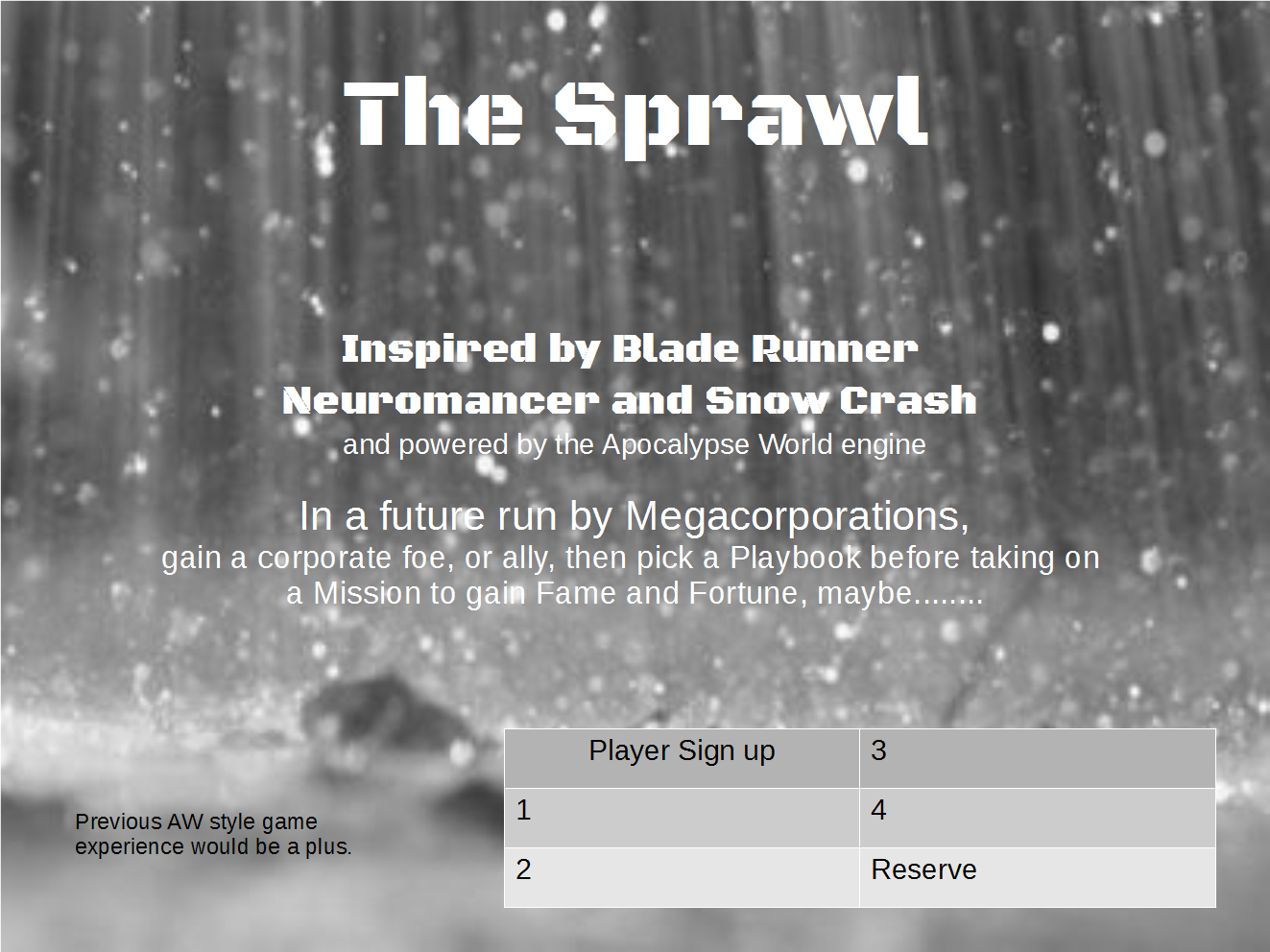
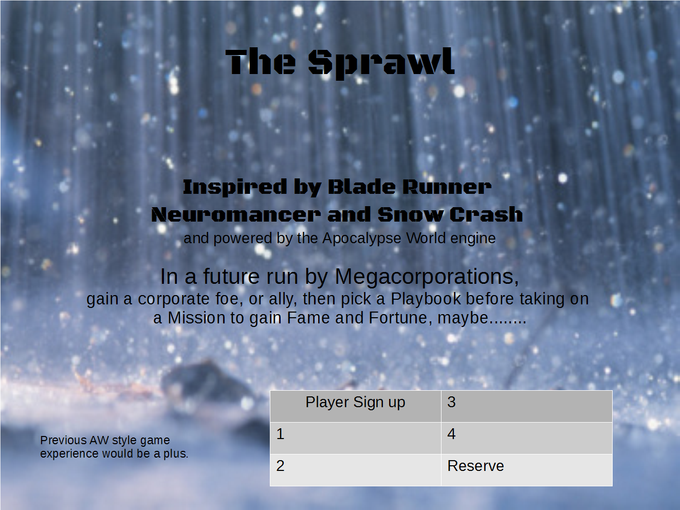
I’ve been playing around with some game sign up sheets. Here in the UK we use a system for quite a few conventions where the GM/MC posts a signup sheet for players at a central location before the game to solicit players. As you aren’t pitching your game in person to the crowd using an interesting but succinct sheet is the only way to attract people to your game over many others available for play. The trick seems to be to convey the game style in a few words and tailor expectations as well.
Here’s a couple of options I did to see what folks think.


Cool. Try with white text (maybe bolder) and colored background. I’d love it.
Also, try to adjust the text size, to create a sort of same-wide column. I hope you understand what I’m saying.
Also, I’d remove all those………. At the end. A simple dot tells enough.
PS Nigel, do you have ready to use character Playbooks? I’d like to test the game with my players, but I have no time to build em all, without the warranty we’ll play it for a while.
I’ll have a go with the white text on the blue background and see how that looks. When I did that before it tended to blur into the raindrops. The series of full stops at the end is usually an indication in British English that there is something left unsaid, some hanging doubt or information not conveyed but hinted at.
I did a bunch of character specific playbooks without the character generation stuff as I was intending to use them with pregens. It was mostly just copy and paste into a odt file. They fit on to two pages of two column landscape A4.
Yeah, in Italy we use the 3dots too. However, usually we “skip” them ’cause they tend to give the text an un-professional look.
About the white text: you shouldn’t have issues if you use a bolder font. In addition, you could apply a slight black shadow (dark blue, even better) under the letters, so they stand up on the background.
Finally, try the “all the rows with the same wide” effect, it’s very appealing.
You can obviously tell I’m no graphic designer 🙂
Do you want the playbooks I did?
I’ve put them in my GDrive at https://drive.google.com/open?id=0BwzePBsqT0NFcFdQX2EwVG1xN1U&authuser=0
I see the folder, but no files inside
Try this. https://drive.google.com/folderview?id=0BwzePBsqT0NFcFdQX2EwVG1xN1U&usp=sharing
Nope. Maybe you have to put the right permission in every file, not just on the folder.
How about now?
Nope.