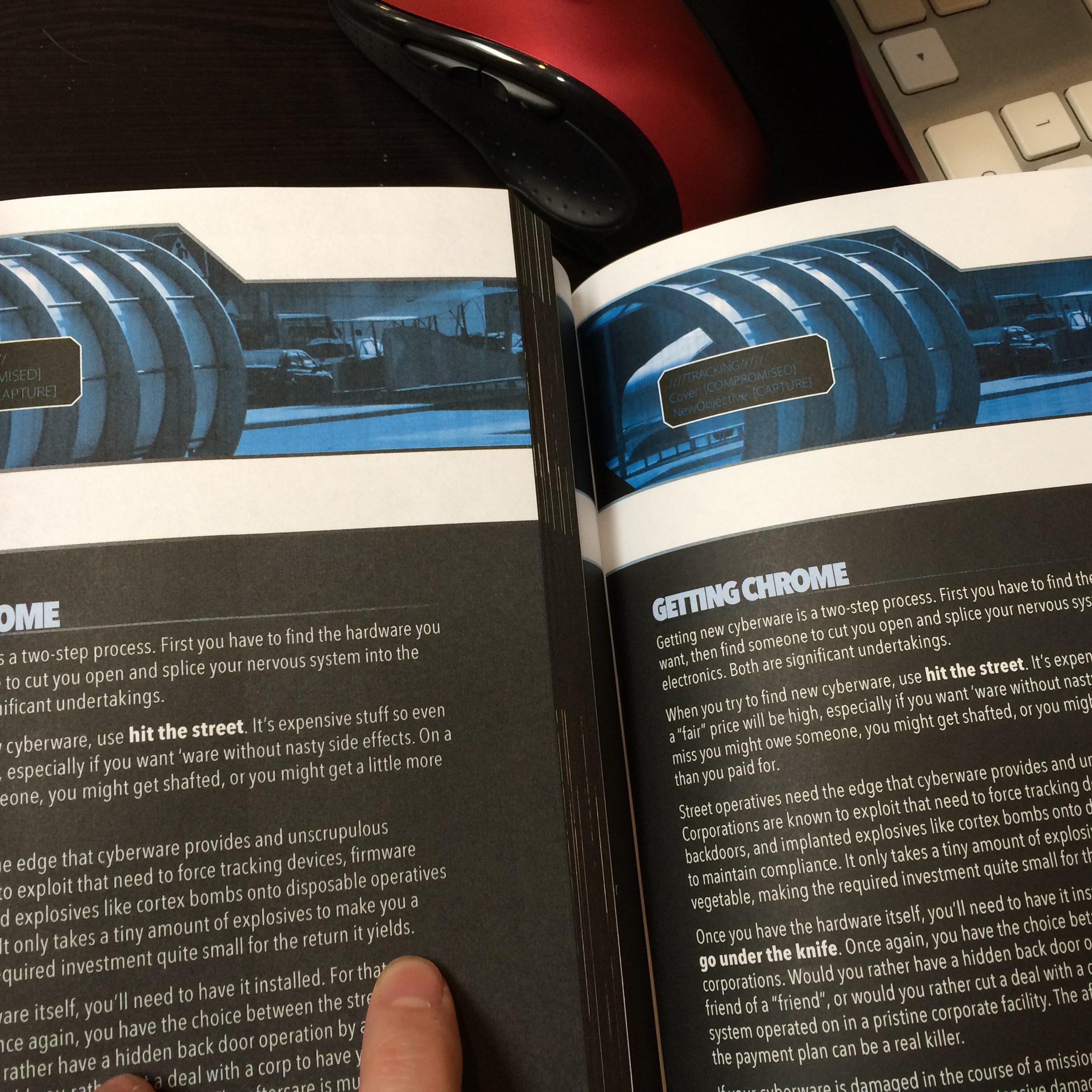
Brian Schoff asked for a comparison shot between the two interior qualities. The left is the softcover (DTRPG Standard Color on 70 weight paper) the right is the hardcover (DTRPG Premium Color).
The difference is clear in person. I’m not sure if it comes out in this photo though.

Relevant to today’s backer update: https://www.kickstarter.com/projects/ardensludere/the-sprawl-cyberpunk-roleplaying-powered-by-the-ap/posts/1609123?ref=backer_project_update
Looking at this on my high-rez screen, I can see the difference between the blacks and the colours, but its more obvious in person.
It looks like the text on the top right would be more difficult to read?
Fraser Simons The blue text in the art? Yeah, interestingly, the colour vibrancy had a negative effect on legibility there. ( Aaron Brown )
Hamish Cameron Yeah, wasn’t sure if it was like that in person too
In person the blue text in the art is less problematic to read (as long as it isn’t getting page glare).
It’s not like it’s pivotal anyways I suppose, eh?
Thanks Hamish! I imagine there will be less of an obvious difference in the NOON version.
Brian Schoff Not such a ubiquitous difference, I imagine, but I expect the premium/hardback will still pop more overall. We’ll know pretty soon!
Is the Premium Colour gloss or matt?
Matte. Both cover and pages.
The only think that’s gloss is the softcover cover.
Hamish Cameron excellent! Most excellent.
Beautiful!
When could we buy them?
I estimate by the end of next week, allowing for variables that the backer update discusses.
Having worked on projects with DT’s Standard and Premium Color, I’d go with the Premium Color books every time. When they’re side-by-side, the Premium Color books look so much better.
Justin Phillips They definitely are.