Far Beyond Humanity Weekly Update #10
(Warning, long post!)
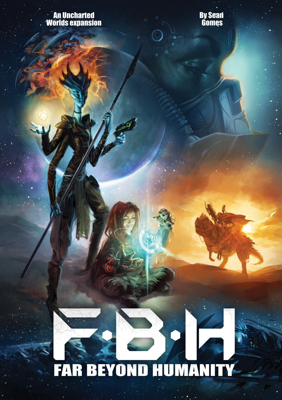
Something a little different for you all this week: the grand reveal of Far Beyond Humanity’s cover art! I thought you might be interested in my process for commissioning my cover art. This is the second cover I’ve commissioned from Aurore Folny and once again she absolutely knocked it out of the park.
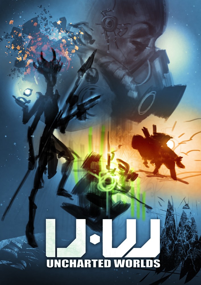
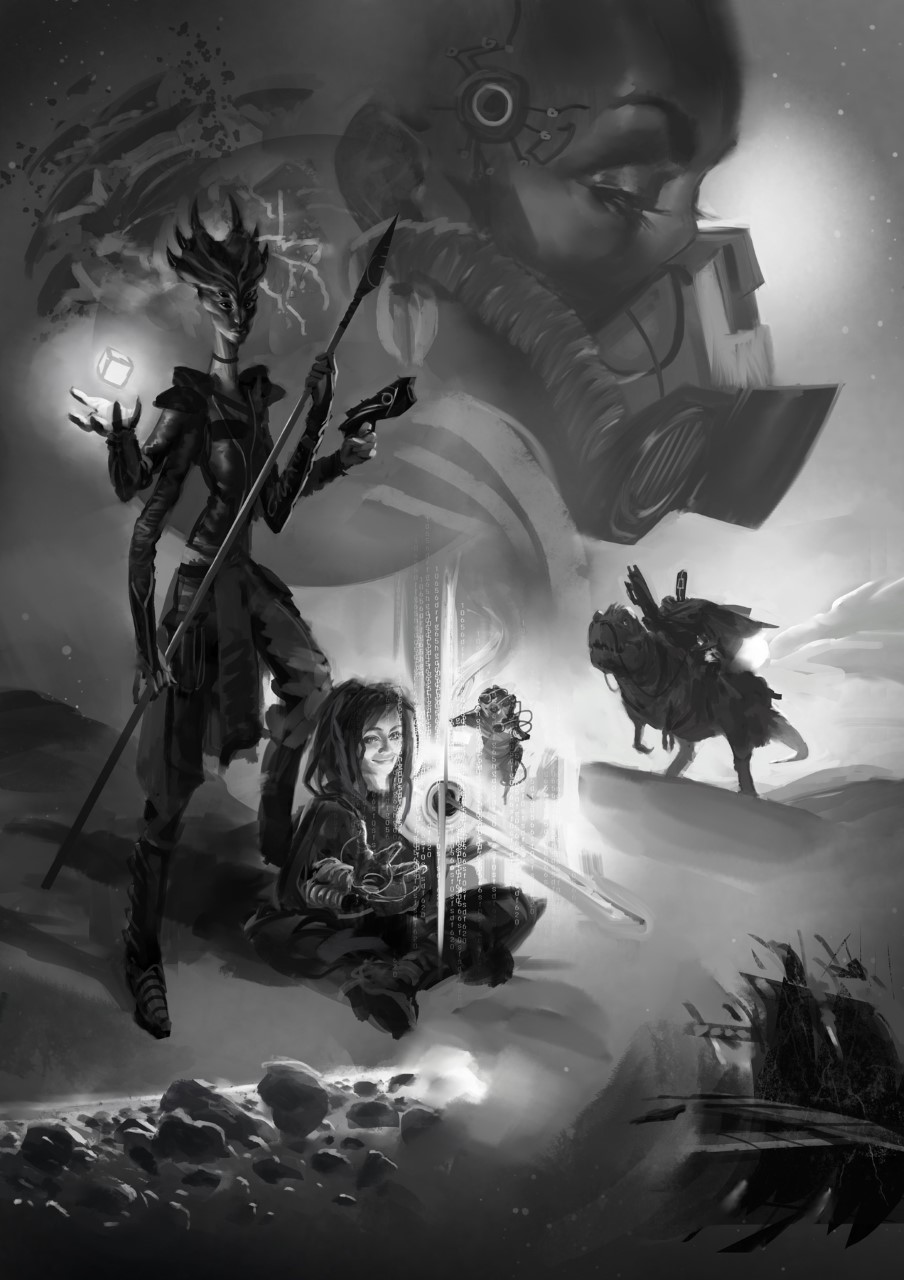
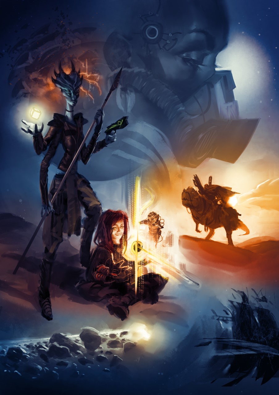
So here’s the Art Direction I sent her, and the progression of sketches that came back. If you guys are interested, I could also go dig up the Art Direction of the first cover as well.
———-
I’m considering something of a cross between the Guardians of the Galaxy and Force Awakens posters: very saturated color, glowing objects/energy, action poses, possibly a profile face in background.
Overall color composition: Blue-green in upper left, transitioning to green in lower left, to yellow and gold in lower right.
Left-side: A very tall, elongated blue female alien with 4 arms, 4 eyes and a crest of horns on her head.
– She’s holding a futuristic spear with two hands.
– Aiming a glowing green plasma pistol with her outstretched third hand.
– Holding a strange object in her fourth hand, near her body. The object floats above her open palm, and glows green.
– She is wearing futuristic armor. No cleavage, mid-riff or exposed legs.
– Feel free to add cultural decorations (rings, cape, cloth, chains, medals, whatever you think would look cool).
Lower left foreground (Slightly more towards center than 4-armed alien): A human street-urchin girl sitting cross-legged with her hands raised, palms up as if in supplication.
– She’s wearing filthy rags and her red hair is a mess of dreadlocks.
– She’s wearing massive technomancy gauntlets.
– She looks very happy, big genuine smile.
– She is surrounded by glowing green numbers a la Matrix.
Lower right side, mid-background: A robot riding on a dinosaur mount (yes, I’m very aware how silly that sounds).
– The robot should be obviously mechanical: Thick, curved plates for chest and forearms, and thin hydraulic/piston tubes for upper arms, waist and neck.
– The head should be a solid, curved plate, and have a single eye that glows yellow-white.
– The robot is wearing a poncho like a cowboy. Those are its only clothes.
– The robot is carrying a heavy-duty laser rifle (the same kind that the woman was carrying in the cover of Uncharted Worlds) in one hand.
– Its other hand holding the reigns of the beast.
– The beast is a sauropod: dinosaur body with a short neck, short legs and dragon-like head. You do awesome dragons so I’ll leave the details to you.
– The beast should be loaded with packs and stuff, it’s a beast of burden.
Lower 3rd, background (Horizon): A rocky, desolate world. Dark brown, rib-like arched rock formations. Whole area is bathed in golden yellow clouds.
Upper right, far background: This is where I’m conflicted.
Either A: A starscape with a close-up profile face superimposed (like the Kylo Ren from Force Awakens or Darth Vader from New Hope)
Or B: An exploding planet.
I’d appreciate your opinion, whether the face in the background would make things look too cluttered.
If we go for the Face option: The profile of a short-haired, dark-skinned woman.
– Her mouth, nose and lower jaw is replaced with a rebreather, with heavy tubes coming out of it going over her shoulder.
– There is a large socket for a cable installed in her temple. The skin around the socket is cracked.
– Perhaps a small earring, either in the earlobe or in the upper ear arch.
So that’s what I got. Before we go too far, maybe just a composition/color super-ultra-rough layout sketch?
Also, I feel like there’s an opportunity for a lens-flare in there somewhere, just for the extra StarWars-y kitsch!
(After receiving a few preliminary sketches)—
I really like the second image, with the face on the right and the exploding planet on the left! We need to make sure it doesn’t look like the back of the woman’s head is exploding, but otherwise I say go for it, that’s a great idea. Really cool!
Quick correction: I’d like the alien to have her gun in her left hand, maybe pointing towards the opposite side of the page (if that doesn’t mess with the composition). The glowy-crystal-object thingy would be in her right hand, close to her body (so that the light it casts illuminates her and the top of the girls’ head/shoulders.)
So, to the questions:
– The woman with the respirator is likely the villain of the story, or at least the Darth Vader-style main threat/antagonist.
– The robot is in the desert. The other two are not, technically they’re in a different scene. A starry background would be fine, or just plain dark blue, or smoke/clouds. Go with your instinct.
– The Technomancer girl is creating/shaping virtual reality with her hands. I guess “supplication” is the wrong word, maybe… “molding”? As if she was using her big magi-tech gauntlets to work a ball of hovering clay.
– The alien and the girl (and technically the robot) are the player characters, so they have roughly even spotlight. Though the robot is a bit more background.
You’re right, totally forgot the Title:
– The title will be roughly the same size as the original UW title.
– I’m going to be putting it at the bottom, like the Starwars posters.
– If possible, could you fill the space behind the title with asteroids to the left and floating starship debris to the right? Kinda like the way the stormtroopers are placed in the Force Awakens poster.
———————-
Hope you guys enjoyed that. I’ll have more Words Words Words updates next week, but work has been continuing apace and the editing process has begun on a few chapters.
-SG


Saaa…weet!
Impressive!
Cool is no enough to describe it!
Clapping to Aurore Folny
And yes, I’d love to be able to sneak in the process that led to the original cover on the corebook.
Neeeeeeeeeeeeeeed FBH t-shirt!
Yeah, this is frickin awesome
That turned out really really well. Looking forward to it!
Also +1 on the T-shirt idea.
That’s dynamite artwork, the same kind of “dynamism” as on the original core rules cover. Different figures, different situations.
This looks almost like a DVD “making of” feature.
Boy that looks really good.
Man, I loved the first color draft! I’d have stopped right there 🙂
Great look!