Carta Galaxia Development Update #15
Happy holidays all! Hope you’re taking the time to relax, spend time with folks you love (and tell them you love them, dagnabbit).
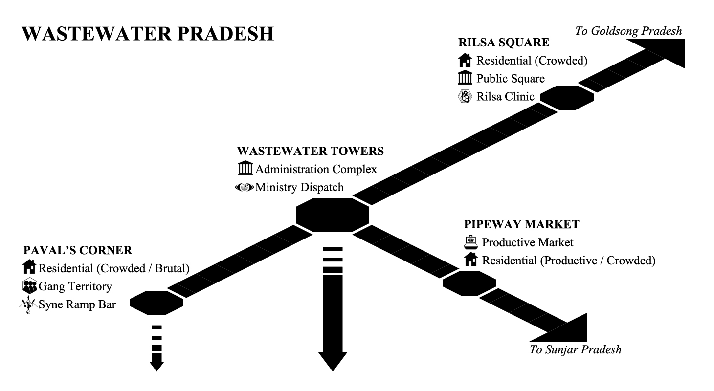
Small update today: This is a direct follow-up to last week’s prototype. The lines are smaller, the text cleaner and more prominent, and I’m experimenting with icons as well. So far I think it’s working pretty well, but I’d be interested to hear what you folk think. Obviously it’s not the full map (see Development Update #14 for that) but style-wise, readability, etc. Opinions/questions/suggestions are always welcome!
Anywho, hope to have more to show next week. As usual, thank you all for your support, your stories, everything you share. Keep it up!
-SG

Looking good so far!
I agree, looks much better