Carta Galaxia – Yet Again

Carta Galaxia – Yet Again

Carta Galaxia – Yet Again

So after carefully considering all the feedback, I’ve decided that I will be starting back up on Carta Galaxia with a reduced scope. I think I over-extended myself and was unable to deliver on what I thought I needed.

The new plan for CG is this: A few pages going over the theory of a topic (Settings, Jump Points, NPCs, Worlds) then a few pages of examples to lift and drop into the game in a pinch. The back of the book will have a slew of pre-made assets to drool over (because while it does add clutter, I’m a little nostalgic for the “gear porn” pages of more traditional games).

Plus I’m toying with something special to me: a Lifepath system for Uncharted Worlds. Just because.

So here’s the new breakdown of Carta Galaxia. I hope to have new chapter previews available soon. That said, I’m going to take things slower to avoid burning myself out again.

Campaign Settings

– – Creating a New Setting

– – Premade Campaign Settings (including factions)

Jump Points

– – Creating a Jump Point

– – Running a Jump Point

– – Premade Jump Points

People and Places

– – Creating New Locations

– – Premade Locations

– – General NPC advice

– – Premade NPCs

Characters

– – Lifepath (alternate character creation)

Running a Game

– – General gameplay (Difficulty, Get Involved, etc)

– – Combat examples

– – Exploration

– – Long Term Campaigns

– – – – New Advancement system (from FBH)

Arsenal

– – Premade Assets

Hi folks. Got a lot to get through so let’s get right into things.

Hi folks. Got a lot to get through so let’s get right into things.

Hi folks. Got a lot to get through so let’s get right into things.

Warning, incoming wall of text

You may have noticed I haven’t been around much. It’s been a pretty awful combination of no sleep, intense workweeks (I work in the videogame industry and E3 is A Thing™), and family stuff (not good news about my father). All that has led to a long bout of non-productivity. Which then lead to significant guilt and beating-myself-up about it, because that’s always helpful, right?

Anywho. I’m starting to sorta feel better. Sorta. The current political climate down south notwithstanding (brrrr). But the time away has allowed me to re-consider what I’m doing. Even before going on unexpected hiatus, I was really struggling to keep going with Carta Galaxia.

What started as a campaign guide morphed into a “how to run a campaign”… and I honestly don’t even know what my target audience is for this thing. I don’t know who I’m writing it for, and I don’t know what’s expected of me. I’m certainly not filled with a burning desire to complete it, it feels more like a chore, and that really shows in the quality of the writing.

Lots of factors are currently weighing on me:

A) This was a kickstarter stretch goal. It would be poor form not to deliver.

B) If this isn’t useful or wanted or well-written, it will be wasted time.

C) In writing this (and FBH) I’m really seeing all the cracks in UW’s design up close.

That third one is the big one. It’s no secret I’ve been mulling over an UW2 (or 2edUW or whatever) for a long while now. When I started this project I was a legit nobody with no previous design work under my belt. I was the embodiment of that “I Don’t Know What I’m Doing” dog-in-a-lab-coat. (Can I say again how profoundly humbling it is that so many people supported my first-time foray into game design?)

UW and FBH have been a huge learning experience, and I’d like to think that I’ve honed my skills enough that I’d like to take a second go at it. I’d especially like to solve a lot of the community’s issues with the game, the places where it’s hard to grok, or doesn’t quite work out as well as it should, or is just inelegant (seriously, who uses the “Clumsy” rules? Anyone? Anyone? Bueller?)

So that’s where I’m at. No decisions yet, but I’m weighing my options very seriously.

I’d be really interested to hear what you all think. I’ll endeavour to be more active in the community again, so please post your opinion (or Private Message me).

Thanks for sticking out with UW and for being such a fantastic community.

-SG

Carta Galaxia – Art Spotlight #5 – “Sheriff”

Carta Galaxia – Art Spotlight #5 – “Sheriff”

Carta Galaxia – Art Spotlight #5 – “Sheriff”

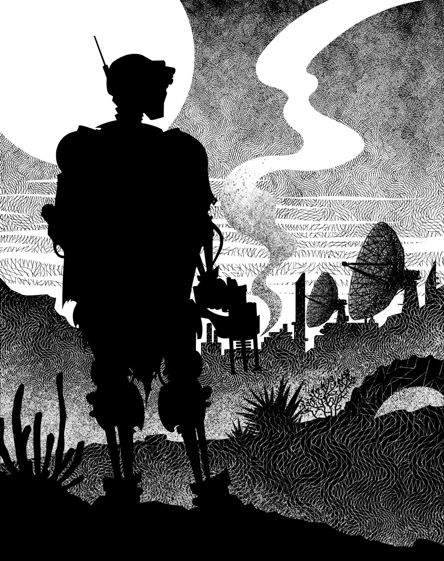
Yet another awesome Claudia Cangini piece, and another movie poster reference. This one is also a callback to the dinosaur-riding, poncho-wearing robot from the cover of Far Beyond Humanity. As usual, the Art Brief is below.

5 – Sheriff

A riff on the old spaghetti-western style of movie poster, specifically the Sergio Leone poster for “A Few More Dollars”. The piece will be separated into 4 “value layers”: foreground, midground, background, sky.

In the foreground (darkest), left of center, we have the main figure: A robot in a poncho. His torso is covered by the poncho, his legs, right arm, neck and head are visible. His limbs are thin and have obvious wiring, hydraulics, pistons, etc. His head is vaguely oval, and slightly blocky, with an antenna extending from the ear piece. He’s holding an advanced looking plasma pistol by his side, white smoke coming out of the barrel. His pose should be very similar to the “A Few More Dollars” poster, but taking up the left side of the image rather than centered.

The midground (dark grey) is the silhouette of rocks, spiky plants, and a half-buried car tire.

The background (grey) is the silhouette of a space colony. Square, blocky buildings with a massive satellite dish array.

The sky (light-grey/white) just has a large circle sun hanging over the town, and a few wispy clouds.

Carta Galaxia – Art Spotlight #4 – “Reach”

Carta Galaxia – Art Spotlight #4 – “Reach”

Carta Galaxia – Art Spotlight #4 – “Reach”

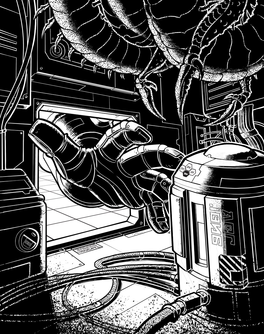
Another wonderful Claudia Cangini piece. This one went through a couple of revisions for scale, placement and such; ended up looking really awesome. I like how the shading elicits juuuuust enough of a double-take to catch what you missed the first time.

4 – Reach

View from inside a complicated machine/computer. In the center is a power core/battery held from above and below by cables. Cables, little lights, pipes, and circuits in the background. From the left, there is an opening, which is the only source of light. An arm is reaching into the machinery from that opening, reaching for the battery. They’re wearing a heavy-duty glove.

In the lower and upper right side, there are hints of an alien creature inside this tight space. A few obviously organic hints of the creatures, like long scythe claws or a spiky, segmented tail. It will mostly be in the dark, the focus will be on the power core and the hand coming from the left.

The soundtrack to the new Battletech game is quite surprising.

The soundtrack to the new Battletech game is quite surprising.

The soundtrack to the new Battletech game is quite surprising. I went in expecting heavy drums, thudding industrial vibes, general stomping, pounding bass. You know; the musical equivalent of big giant heavily armed mechs.

Instead we get swelling strings carrying much of the melody, the occasional heroic brass section, and haunting, echoing vocals. The drums are relegated to the far background, rumbles of distant thunder. The whole soundtrack would not go amiss in a Fantasy setting, which is quite unusual for such a mecha-influenced Sci-Fi property.

The end result is a soundtrack that builds slowly, and has lots of serene passages. I was expecting a war-time soundtrack, and ended up with something more suited to drama and character moments. Perhaps a deep space travel, with the haunting vocals paired with incandescent nebula. The whole soundtrack sounds more like something from a movie.

There are a couple of grindy/mechanical pieces, but these are short-lived, and the exception, not the rule. And even then, the mechanical pieces have strong hymn qualities, like the “Mech Bay Cantatta” (46:06), a slow, clicking, clanking, thumping melody overlaid with Gregorian chanting (very Adeptus Mechanicus). The real heavy pieces kinda start showing up towards the middle, before heading back into soulful string and brass.

https://youtu.be/kodD59WAByE

Carta Galaxia – Art Spotlight #3 – “Forbidden”

Carta Galaxia – Art Spotlight #3 – “Forbidden”

Carta Galaxia – Art Spotlight #3 – “Forbidden”

Bit of a hiatus, dealing with family stuff and general work overload. But we’re back with another awesome Claudia Cangini piece, along with the Art Brief.

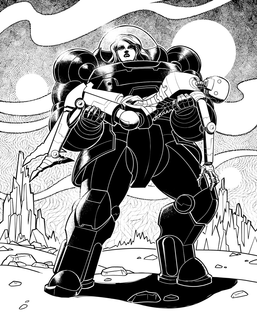
3 – Forbidden

This is a remix/homage of the classic Forbidden Planet poster. Replace the robot with a woman in a bulky power armor suit whose helmet looks like the robot’s dome. She should look like the fainting woman in the cover. Replace the fainting woman with a thin (gender netural) robot. Background/clouds should remain roughly the same. No need for the poster text.

Hi folks.

Hi folks.

Hi folks. I’ve been having some really weird bugs with this Community. Can anyone check and tell me if they can see posts I made in Carta Galaxia or anything past a month ago?

[edit] Apparently Google+ changed the default settings to “Top Posts”, which means hiding most of them? Seriously it’s like Google is actively trying to kill this platform. That and Hangouts.

Carta Galaxia – Art Spotlight #2 – “Tactics”

Carta Galaxia – Art Spotlight #2 – “Tactics”

Carta Galaxia – Art Spotlight #2 – “Tactics”

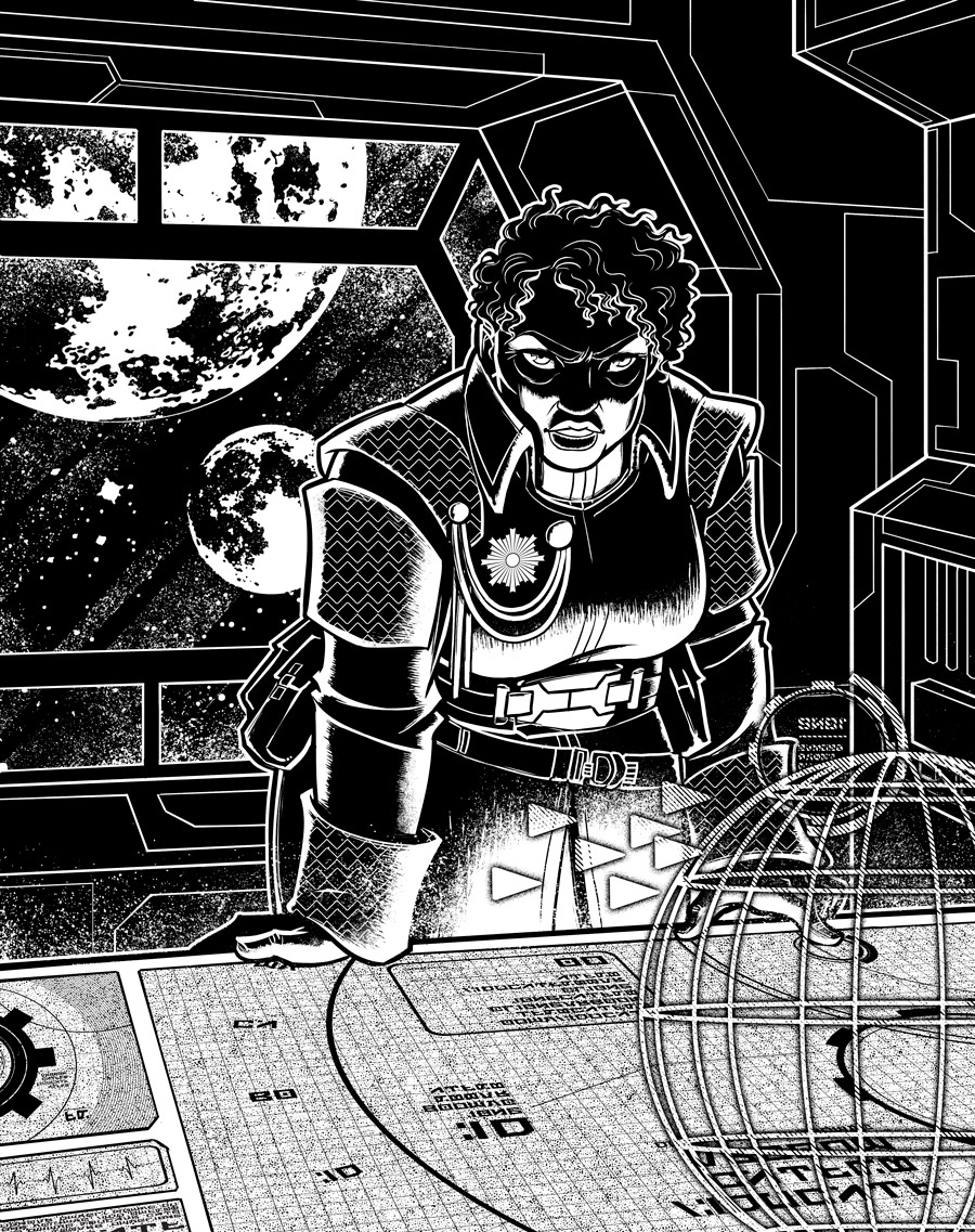
Continuing our series of art spotlights, another piece by Claudia Cangini, plus the Art Brief.

2 – Tactics

A middle-aged, heavy-set black woman wearing the uniform of a galactic navy admiral. She stands tall in a dark command room. There’s a holographic galactic map displayed on a table below her, and she’s pointing at a sector. The admiral is underlit by the light from the table. Various UI elements are holographically highlighting the tip of her finger. Behind her is a circular window and a starfield.

Carta Galaxia – Art Spotlight #1 – “Recharge”

Carta Galaxia – Art Spotlight #1 – “Recharge”

Carta Galaxia – Art Spotlight #1 – “Recharge”

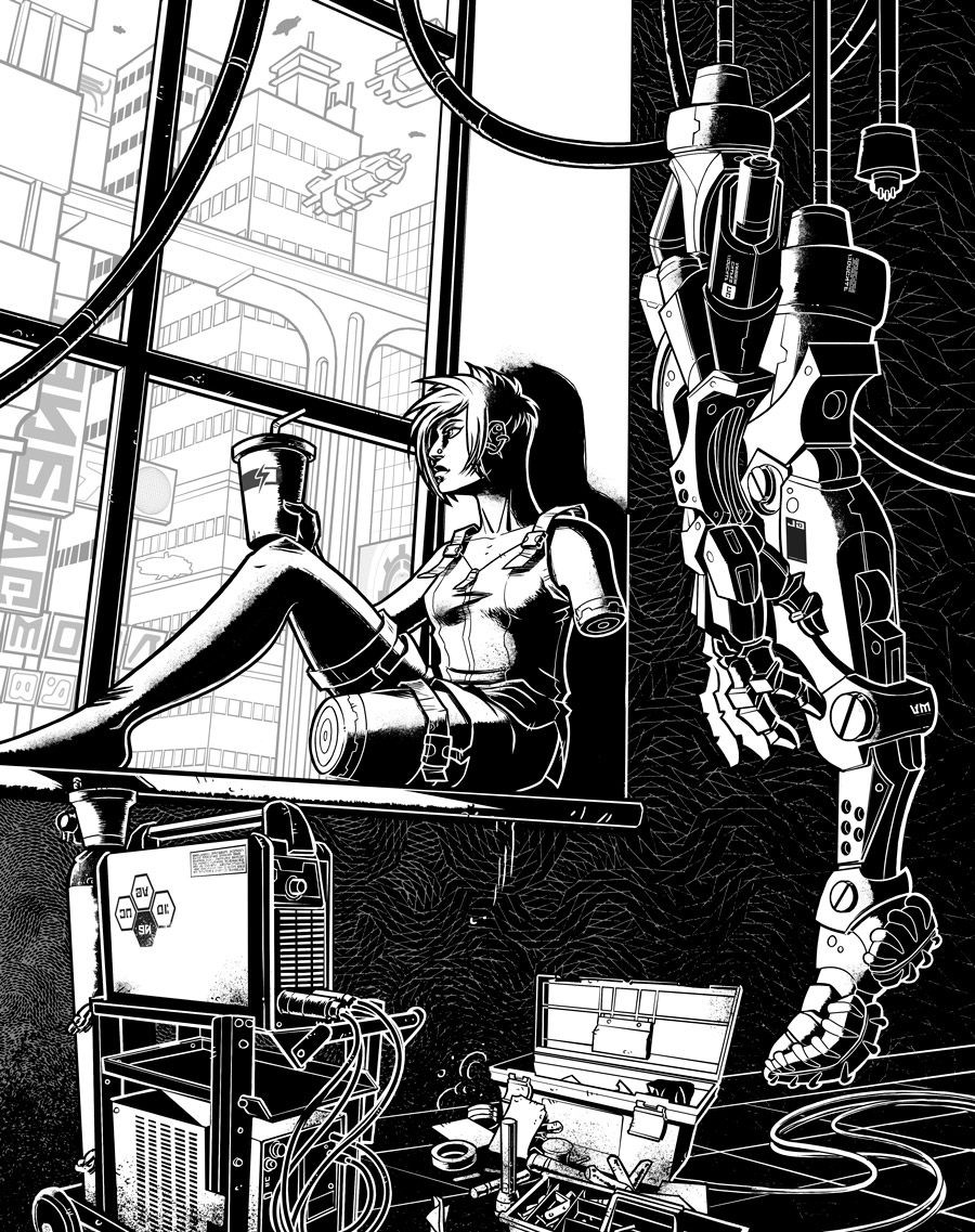
In the Art Spotlight, we’ll take a look at the chapter art for CG (by Claudia Cangini), as well as the artist brief.

1 – Recharge

A young, scrawny woman sits in the foreground in a window frame, looking out at the city in the background. She’s lounging with her back against the side of the window frame, one leg bent. The woman is skinny, and she’s wearing a tanktop and shorts. Her left arm and left (the ones facing the viewer) is missing, and her shoulder and mid-thigh end in cybernetic sockets. She’s holding up a fast-food soda cup with a “re-charging” icon on it.

Her cybernetic arm and leg are hanging from dangling recharge cables on the opposite side of the window. They should look well-used and obviously robotic in nature.

The city in the background is a typical futuristic city scene, oddly shaped skyscrapers, flying cars, cloudy sky, whatever fits in the framing between the young woman and her cybernetics.

Artist: Claudia Cangini

Carta Galaxia Development Update #22

Carta Galaxia Development Update #22

Carta Galaxia Development Update #22

Awesome News: Interior Artist for Carta Galaxia!

I’m very pleased to announce that Claudia Cangini will be doing the art for Carta Galaxia. You may recognize her work from Fate Accelerated, 1001 Nights, The Watch, and so many others.

I’ve been a big fan of her use of shadow and light, patterned textures, and most importantly the diversity of shape, age, and ethnicity that she lends her characters (especially the women). You can bet that I’ve been leveraging those strengths in my artist briefs.

In a couple of days I’ll be revealing the first piece along with the creative brief.

Writing Stuff… or lack there-of

Whuff. Tough couple of weeks on my end, I’m afraid. Rough days at work, coupled with a toddler in the throes of the terrible twos. Not much to show, writing-wise. I’m hoping things will pick up soon. Maybe as we warm up into spring and I start getting more sunlight.

-SG