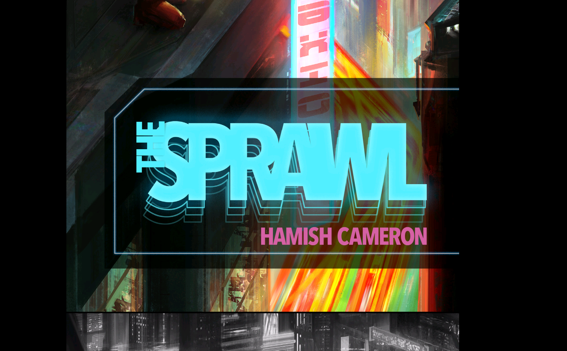
And this is a part of the cover. Here, you can see how the “THE” is really overlapping the “S”, creating a bad (imho) effect.
And this is a part of the cover.

And this is a part of the cover. Here, you can see how the “THE” is really overlapping the “S”, creating a bad (imho) effect.
Comments are closed.
I don’t know, I thought it was going for the I’m-either-on-drugs-snd-can’t-see-straight or Life-is-so-fast-paced-everything’s-a-blur look
I don’t know if it makes it better or worse for you that it’s an intentional design choice. I hope better?
Ok Hamish, thanks for the reply. Of course, it’s matter of tastes, so, I can live with that! 😉
the “neon dropshadow” for lack of a better term is GREAT. i have my issues with the logo too, but this little touch adds a lot! nice.