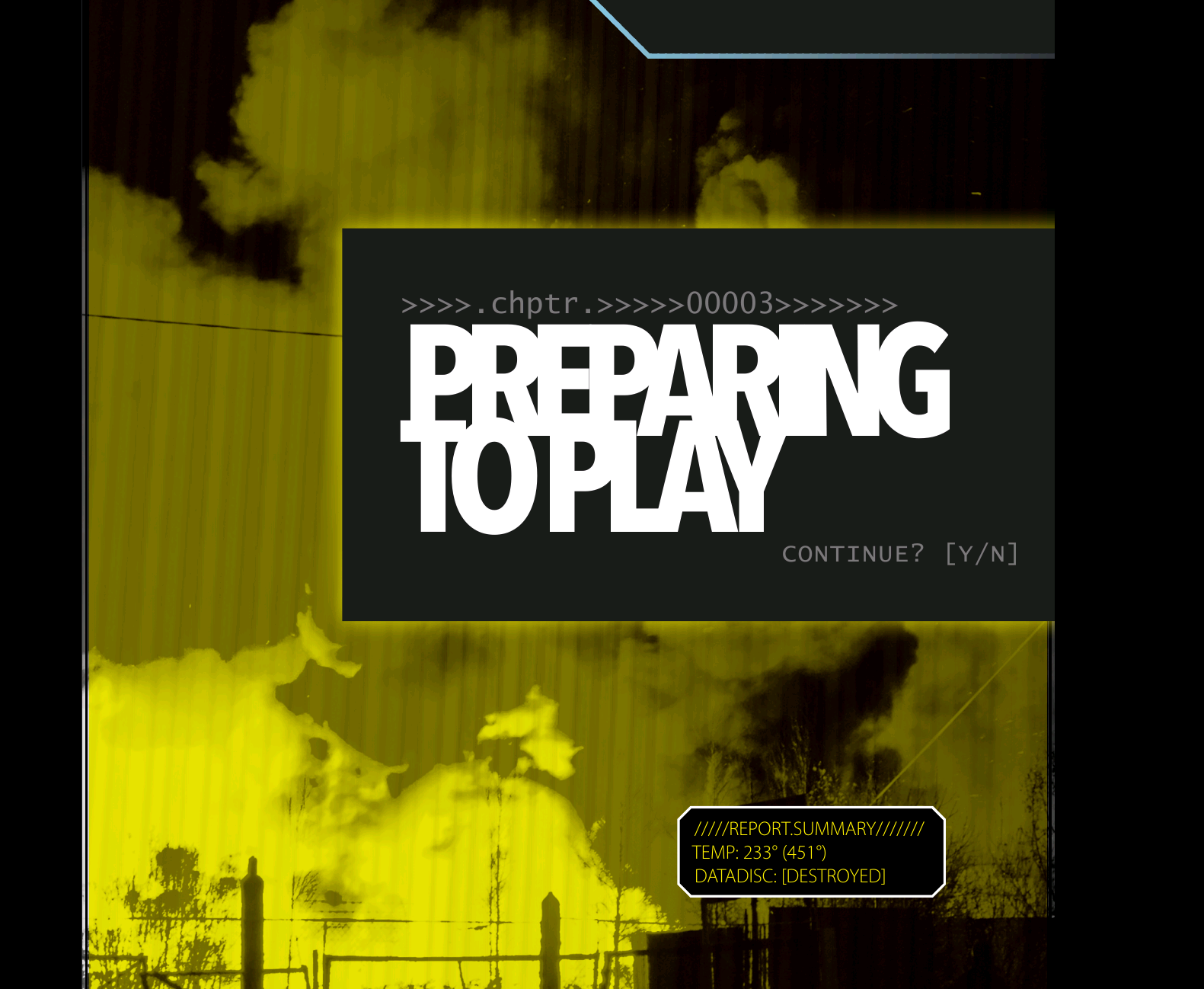
Hi Hamish Cameron. I took a screenshot of a page, to make sure I see the same font as you do. As you can see, it’s really cluttered, “RIN” is almost unreadable, also the lines are really overlapping.
I love “particular” layouts, however I don’t like this combination too much.
Yup, I get that. You are seeing the titles as intended though, so no worries there.
As I’ve said before (probably to you as well, so sorry if I’m repeating myself) the design is supposed to evoke the crush of The Sprawl and the claustrophobia of living and operating under corporate domination.
This is probably the aspect of the game that people have the most issue with, which I take as a good sign for the rest of the game!
Yes, I’ve never had any problems with the game itself – I just find that the presentation has serious problems around the legibility of text… in particular, the contrast of the white-on-black pages, and the runtogetherness of the heading fonts. Which is a pity, because it really spoils an otherwise excellent game…
I think it looks rad!!! I like the design choices. Congrats on going live.